
This Deceiving Chart Is Costing You Money (Guaranteed)
 I saw an interesting tweet the other day—someone commenting on how lots of people have no qualms racking up $100,000 in debt to get a university degree but think putting $5,000 into the stock market is too risky.
The foolishness of this thinking is evident to anyone familiar with the stock market. Five-thousand dollars in a bland S&P 500 index fund like the SPDR S&P 500 ETF (SPY) would now be worth $12,175 after just a decade. That’s a lot of money to give up on just because of fear!
And don’t be fooled: this kind of thinking isn’t prudence. It’s fear. People who avoid putting money in the stock market do so because they’re afraid that something like the 60% decline of 2008–09’s market crash (the biggest meltdown in 80 years, by the way) will happen again.
For those familiar with psychology, this thinking is familiar: it’s a mix of the loss-aversion fallacy (people’s tendency to avoid small losses more than they will seek big potential gains) and recency bias (the tendency to assume things that happened recently are more likely to happen again, just because they happened recently).
Instead of trying to convince you that this thinking is wrong, I’d instead like to explain how the media encourages this mindset—and how you can spot it. Then I want to show you how it can cost you a lot of money.
How a Simple Chart Switch Dupes Millions of Investors
There is a strong tendency among many news outlets—some mainstream, some not so much—to make bold pronouncements about the future, even when they don’t have the data to back it up. And since fear gets attention, which is what these outlets need to earn a profit from selling ads, these pronouncements tend to be bearish, if not apocalyptic.
To make matters worse, it’s easy to use charts to make these bearish pronouncements look like they are backed by data, even when they are not. The most common trick is also one of the easiest: use price-return instead of total-return charts.
Before I give you an example, let me explain the difference. The price return measures the return of a stock or index based solely on the change of its market price. The total return measures the return based not only on its market price but also with dividends factored into the equation.
Even with the S&P 500, which yields a paltry 2% or so most of the time, this is a very big deal. Those dividends add up over a period of years, and ignoring them gives you a skewed and inaccurate picture of how stocks actually performed.
One of the greatest permabear stories brought out to scare people into avoiding the stock market is that, from 2000 to 2012, the market was essentially flat. And you can demonstrate this with a price-return chart like this one:
A Flat Market—According to One Story
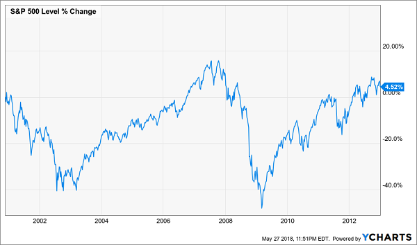
Since the market price of the S&P 500 is reported daily, people are trained to focus on this kind of metric anyway, so regurgitating it doesn’t even seem deceiving.
However, it really is.
Let’s take a look at how the S&P 500 performed on a total return basis compared to just the price return over the same time period:
Not So Flat Anymore!
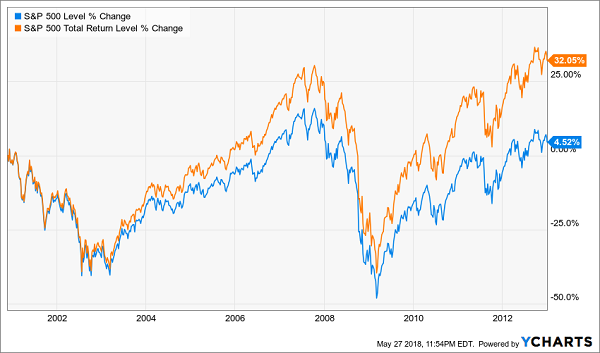
The real story is quite different! Admittedly, 32.1% is a poor return over a decade, partly because the market was facing a tough comparison against the dot-com bubble—which was an even crazier bubble than the housing bubble that followed it—but it’s a much better return than 4.5%.
And for long-term investors, this distinction is crucial. Look at how the S&P 500’s price return compares to the total return from 2000 to today—it’s nearly half!
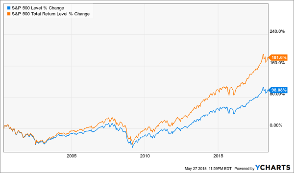
Price Return Tells the Real Story
The Price-Return Fallacy on Steroids
I like to call this obsession with price returns, and the wrong conclusions it leads to, the “price-return fallacy.” And while it’s important when it comes to the stock market, it becomes much more important when talking about higher-yielding investments.
When it comes to closed-end funds (CEFs), this thinking is toxic. The reason? Many CEFs are designed to have a flat or even declining market price while also paying dividends of 7% or more. As a result, CEFs’ price-return charts are even more misleading than those of the S&P 500.
Let me demonstrate this with a high-yield example: the PIMCO Corporate & Income Opportunities Fund (PTY), which specializes in corporate bonds and bond derivatives, uses leverage and focuses on paying out a high income stream to shareholders—it currently pays a 9.2% dividend.
I mention these aspects of the fund because I’ve heard dozens of financial professionals—CFA charterholders, financial advisors, star financial bloggers and financial journalists—decry PTY or funds like it as dangerous investments that provide a low return over time. When I asked one advisor to explain this view, he told me to look at the price-return chart for PTY over the last decade.
PTY’s Unappealing Price Return
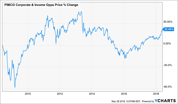
A 22.4% gain isn’t good, especially since the S&P 500 is up 96.4% over the same time period.
But again, this is the price-return fallacy. Now let’s add dividends to the mix and see what happens.
A Meteoric Rise
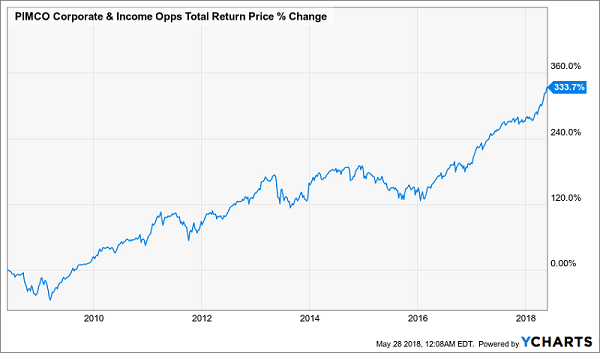
A 333.7% return is very different from 22.4%! Also, you’d be pleased to know that PTY’s 333.7% total return over the last decade is over twice as big as the S&P 500’s 143.7% total return over the same period.
Those financial advisors who warn against PTY and funds like it are costing their clients money. And their clients are getting fooled because they’re getting duped by the price-return-chart fallacy. Don’t be like them—always look at total returns.
The 8 Best 8% Dividends with Big Upside to Buy Today
Most Wall Street spreadsheet jockeys say we investors can’t have both the income and safety of bonds and the upside of stocks. We have to choose, or allocate, or whatever.
They’re wrong. They don’t realize that the nine bond funds in my Contrarian Income Report portfolio have delivered average annualized returns of 23.9% (including dividends)!
My three top picks today are poised to continue the tradition. These funds are a cornerstone of my 8% “no withdrawal” retirement strategy, which lets retirees rely entirely on dividend income and leave their principal 100% intact.
Well that’s not exactly right. Their principal is more than 100% intact thanks to price gains like these! Which means principal is actually 110% intact after year 1, and so on.
To do this, I seek out closed-end funds that:
- Pay 8% or better…
- Have well funded distributions…
- Trade at meaningful discounts to their NAV…
- And know how to make their shareholders money.
If you’re an investor who strives to live off dividends alone, while slowly but safely increasing the value of your nest egg, these are the ideal holdings for you. Click here and I’ll explain more about my no withdrawal approach – plus I’ll share the names, tickers and buy prices of my three favorite closed-end funds for 8.5%, 8.7% and 8.9% yields.
Category: Closed-End Funds (CEFs)


